Every time I do a column layout I end up with some hackery to make everything look nice. With the new(ish) flex CSS styles, this should all be thing of the past. Flex is a prefect fit when it comes to aligning content in to self sizing and positioning blocks!
We could take a look at the (very looong) draft (here: http://dev.w3.org/csswg/css-flexbox/), but who reads the manual anyway 😉 Lets look at some working examples!
Before we go any further though, please be aware that this fancy flex stuff only works in modern browsers! Supported versions can be found here: http://caniuse.com/#search=flex
Also note that flex has a strange history where the syntax kept changing. In its oldest form there was the ‘box’ syntax (display: box) then came some strange hybrid thing (thank you IE10) with the ‘flexbox’ syntax (display: flexbox;) and in its current form we have the flex syntax (display: flex;).
Everything in this post is based on the modern ‘flex’ standard.
To create a layout based on flex we first need to create a flex container. There are two choices here: ‘flex’ and ‘inline-flex’. They behave as you might expect. One is a block element, the other inline.
Next thing is the flow inside the container. There are the ‘flex-direction’ and ‘flex-wrap’ options. The directions are ‘row’, ‘column’ and both have a reversed order (ie: row-reverse) to reverse the flow in the container. Wrapping has only two choices, either ‘wrap’ or ‘nowrap’. It controls whether children can wrap to multiple lines or not. A shorthand exists that sets direction and wrapping in one go: ‘flex-flow: ‘.
To control how space is distributed inside the container we have ‘align-content’.
– center
Items start at the center of the container and flow outward so that the space before the first item and after the last item is the same.
– flex-start/flex-end
Items start at the start/end of the container and stacked against each other.
– space-between
Space between the items is the same and the first and last item are are flush against the outside of the container.
– space-around
Space between the items is the same and the first and last item have a space of half the space between to items and the outside of the container.
If that all sounds a bit cryptic, don’t worry. Experiment with them a little and you’ll find their use quite simple.
Last thing on the container is ‘align-content’ which operates on the items distributed across multiple lines. It gives control over spacing perpendicular to the flow direction. It has the same options as ‘justify-content’ but with an extra ‘stretch’ option that makes all the children match each others size on the cross-axis. Same applies here, experiment a little to find out what every setting does. Explaining in text is quite hard 😉
All right! Here is some CSS that describes a flex container (and a placeholder for its children).
.flex-container {
    display: flex;
    flex-flow: row nowrap;
    justify-content: center;
    align-conent: stretch;
}

.flex-container .flex-item {
    border: 1px solid #000;
}

.flex-item.big {
}
Using this DOM with the CSS above…
<div>

    <div>1</div>
    <div>2</div>
    <div>3</div>

</div>
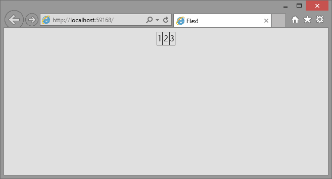
We get something that looks like this:
Notice how the divs are now packed in the center and not claiming the maximum width like block elements normally do. They flex to the middle of the page in a row.
The divs are flexing already, but not in a very useful way yet. We still need to tell them how to resize. To control the size of flexing items we have a few styles at our disposal:
– flex-grow
– flex-shrink
– flex-basis
And the shorthand to set them all at once: ‘flex’. Grow and shrink control the factor by which items resize inside the container. Basis controls the initial size of the flexing element.
The shorthand offers a few predefined options which are ‘auto’ (same as flex: 1 1 auto;), ‘none’ (same as flex: 0 0 auto;) and ‘initial’ (same as flex: 0 1 auto;).
The grow and shrink factors must be numbers greater than 0 to take effect. The ‘basis’ value is a length of any unit (%, em, px, etc).
Knowing this we can make the divs we have resize themselves. Lets say we want to make div 2 twice as big as 1 and 3. Set the factors to match the description above. The size of divs 1 and 3 have a factor of 1, giving div 2 a grow factor of 2 will make it twice as wide as divs 1 and 3.
.flex-container .flex-item {
    border: 1px solid #000;
    flex-grow: 1;
}

.flex-container .flex-item.big {
    flex-grow: 2;
}
Setting a grow factor of 3 on the second div will make it three times larger than divs 1 and 3. And thanks to the flex container, resizing has no effect on the divs. It auto-sizes according to our specified factors.
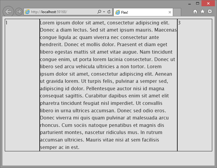
That was pretty easy 🙂 We now have a basic column layout! One of the common tricks in this kind of layout without flex is making sure all the columns have the same height. With flex we don’t need any hacks at all. In our CSS for the container we told it to stretch the items keep them the same height. If you now put content in one of the divs and its height changes, all the columns follow the height of the tallest column!
Be aware that by not setting an initial width using ‘flex-basis’ the content of the outer columns is reduced to the minimum width of the content within it! If we adjust the CSS to this:
.flex-container .flex-item {
    border: 1px solid #000;
    flex: 1 1 20%;
}

.flex-container .flex-item.big {
    flex: 2 1 80%;
}
We control the initial size of the elements and the factors now operate on the initial value.
With this basic understanding of flex you should go a long way in creating layouts. In the next post I’ll lay out something a bit more complex using flex 🙂
Have fun flexing!


