In an earlier post I promised to show a layout based on the CSS flex system that looks a little bit more like an actual web page layout instead of just a bunch of columns. If you want to know about flex in a bit more detail, check that post out.
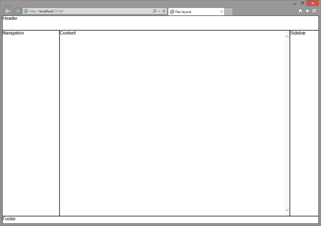
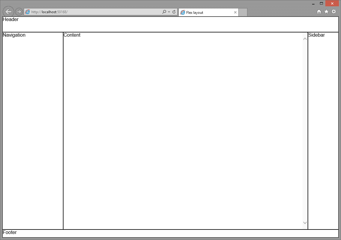
Here is a basic layout, a header and footer, a content section navigation and sidebar:
And the DOM that is used to create this layout:
<!DOCTYPE html>
<html>
<head>
    <meta name="viewport" content="width=device-width" />
    <title>Flex layout</title>

    <link href="flex.css" rel="stylesheet" />
</head>
<body>

    <header>
        Header
    </header>

    <main>

        <nav>
            Navigation
        </nav>

        <article>
            Content
        </article>

        <aside>
            Sidebar
        </aside>

    </main>

    <footer>
        Footer
    </footer>

</body>
</html>
Nothing special, a very basic set of nested elements. The layout above can be achieved using absolute positioning, but why would you, if you can do it with flex! Here is all the CSS required to make the elements spring into action to form the layout in the screenshot:
header,
nav,
article,
aside,
footer {
    border: 1px solid #000;
}

html,
body {
    height: 100%;
    margin: 0;
}

body {
    font-family: Arial, 'DejaVu Sans', 'Liberation Sans', Freesans, sans-serif;

    display: flex;
    flex-direction: column;
    flex-wrap: nowrap;

    min-width: 1000px;
}

header {
    height: 50px;
}

main {
    flex: auto;

    display: flex;
    flex-direction: row;
    flex-wrap: nowrap;
}

main > nav {
    width: 200px;
}

main > article {
    flex: auto;
    overflow-y: scroll;
}

main > aside {
    width: 100px;
}

footer {
    height: 25px;
}
Some fixed widths/heights are used to constrain elements that don't require any fluidity that flex can provide such as the header and footer. The sidebar and nav are also fixed in place but notice how the CSS does not specify any specific positions for the elements. This layout uses two container elements, body and main. They are set to display: flex; and let their children flow in the right direction (body flows into a column, main into a row). Header, main and footer are stacked like column and automatically consume their maximum width. nav, article and aside are pushed into a row by the main element. A great benefit of flex is that the elements contained in main consume their maximum height to form an even row across the entire width of the main element. No height adjustments or faux-columns needed. The nav and aside have fixed widths so they are set in place. The main element has its flex propery set to auto which lets it be elastic and maximize its space automatically.
There is one catch and that is that overflow isn't handled properly without setting it explicitly. If the content of the article element is larger that the element itself it will leak into the footer element. Since we don't want that nasty behavior we tell the main element to overflow with a scrollbar (I chose scroll here, but auto works just as well). Resizing the window has no effect on the layout and all elements adjust to the new size automatically. To prevent the layout from collapsing on itself if the window is made to small, the body element has a min-width set.
This example was created using Internet Explorer 11 but other browsers should work well if they support the modern flex syntax (see here).
We now have a flexible layout that adjusts itself to new window sizes by itself. To take it to the next level, you could use meda queries to transform the layout into a mobile friendly version. But that, dear reader, is one for you :-)
A demo can be found here: http://codepen.io/Harrewarre/pen/sjtJH